Redesigning the mobile experience to connect schools and families
Context
Digistorm School App is a white-label mobile platform that helps schools communicate with families. Nearly a decade after launch, the team made the decision to completely rebuild the core modules and third-party integrations, driven by accumulated issues with scaling and a need to modernise the technical foundation. Adding new modules or integrating third-party school management systems was complex and time-consuming, and the lack of a shared component framework meant inconsistencies were compounding with every new addition.
How might we redesign the interface to support the addition of new modules and seamless integration with third-party systems while enhancing the experience for parents and families?

Research
School branding was conflicting with the interface
The existing system applied school colours directly across headers and components, which worked well for neutral palettes but created visual conflicts for schools with stronger primary colours. The interface needed a more considered approach to where and how colour was applied.
Inconsistent patterns increased effort for every new module
Each module had been designed independently over time. Without a shared system to build from, patterns were being recreated from scratch with each addition, slowing the process and producing inconsistent results.
No shared component framework meant no consistent baseline
There was no common foundation connecting the modules. Addressing inconsistencies individually wasn't sustainable and the redesign needed to solve it at a structural level.
Key Interface Decisions
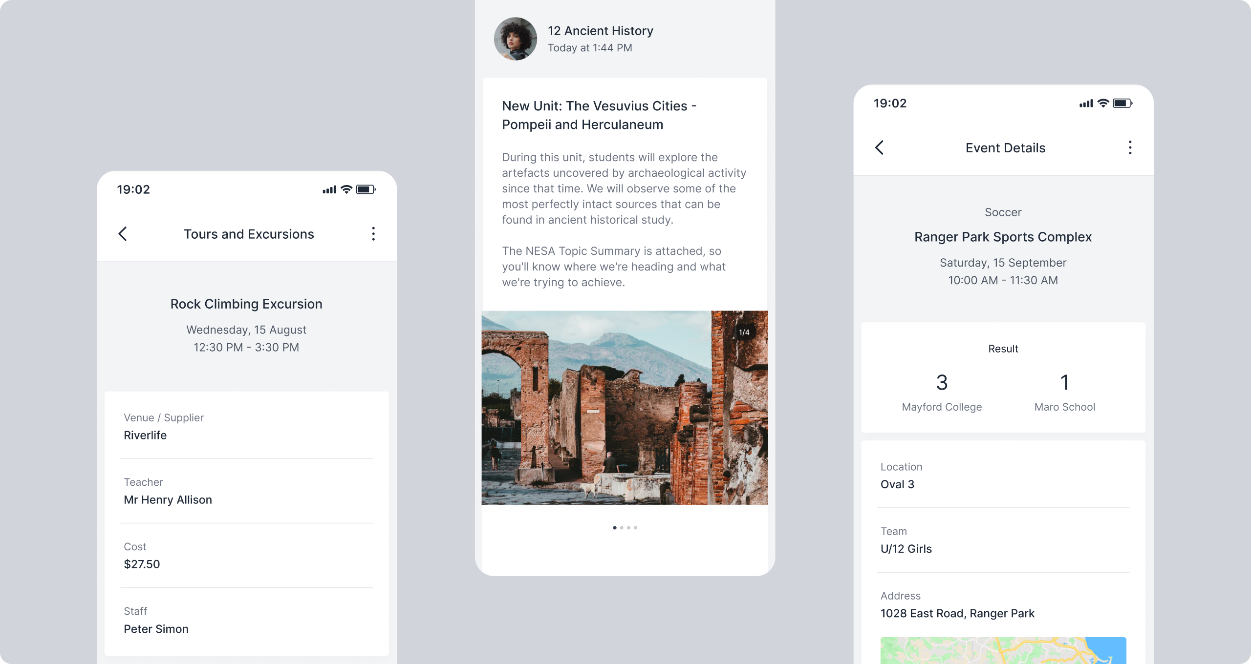
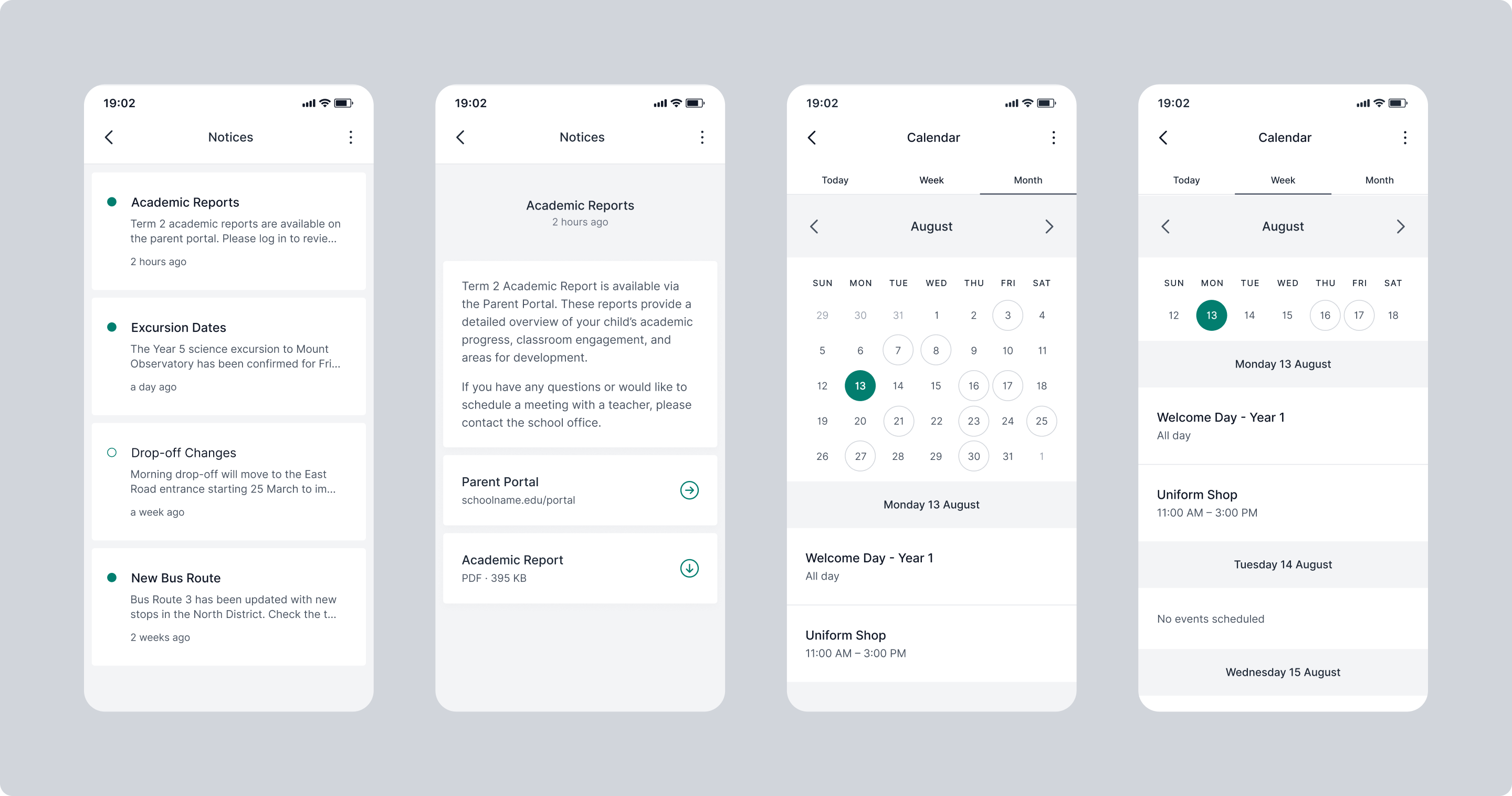
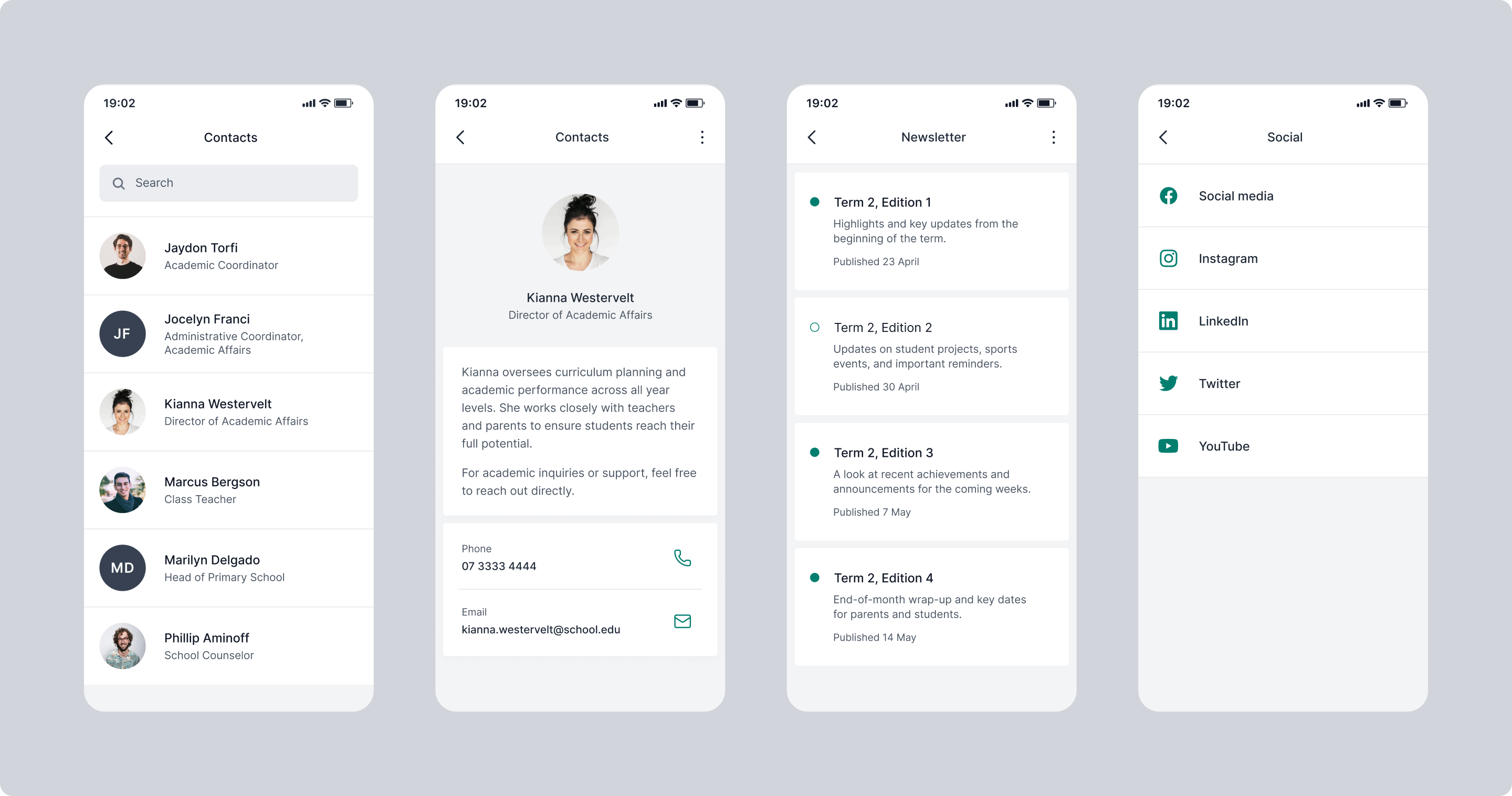
Standardised navigation and module structure across the entire app
Navigation and module layouts were redesigned to a consistent structure across the platform. Parents get the same patterns across the whole app experience: daily news, events, notifications, or third-party modules all follow the same logic.
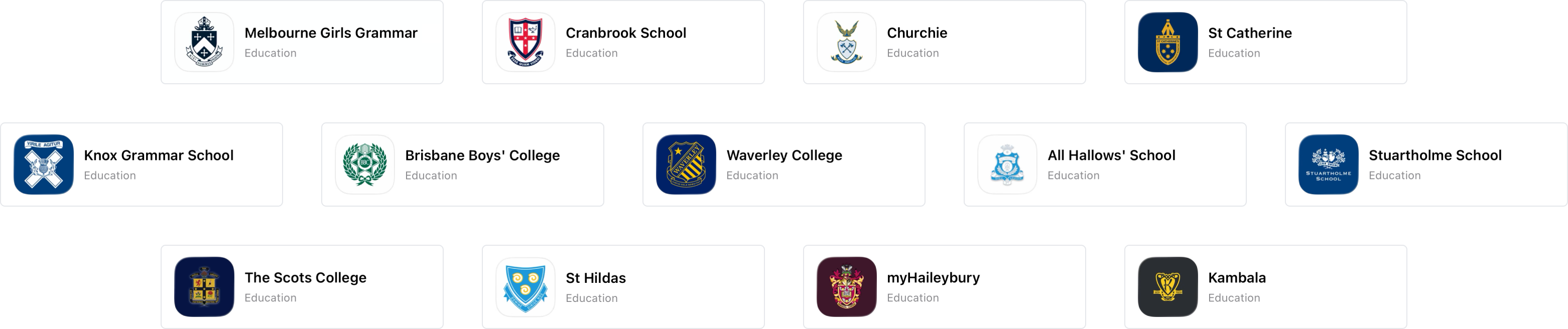
A flexible white-label design system built for any school
The redesign defined specific areas and components where school colours would be applied, giving the team a clear framework to work from during setup. This meant the interface could accommodate a much wider range of school palettes without compromising the overall visual experience.
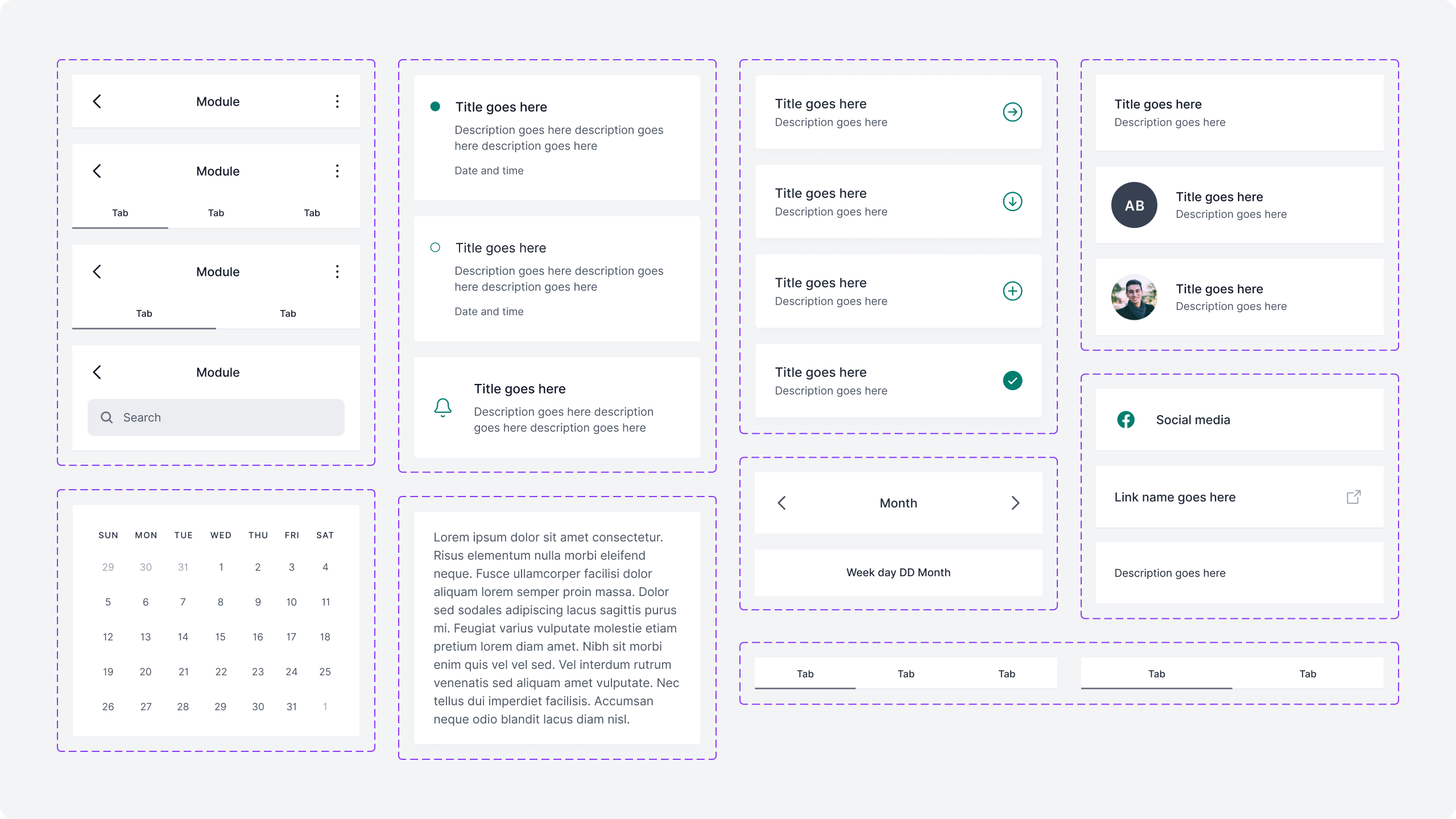
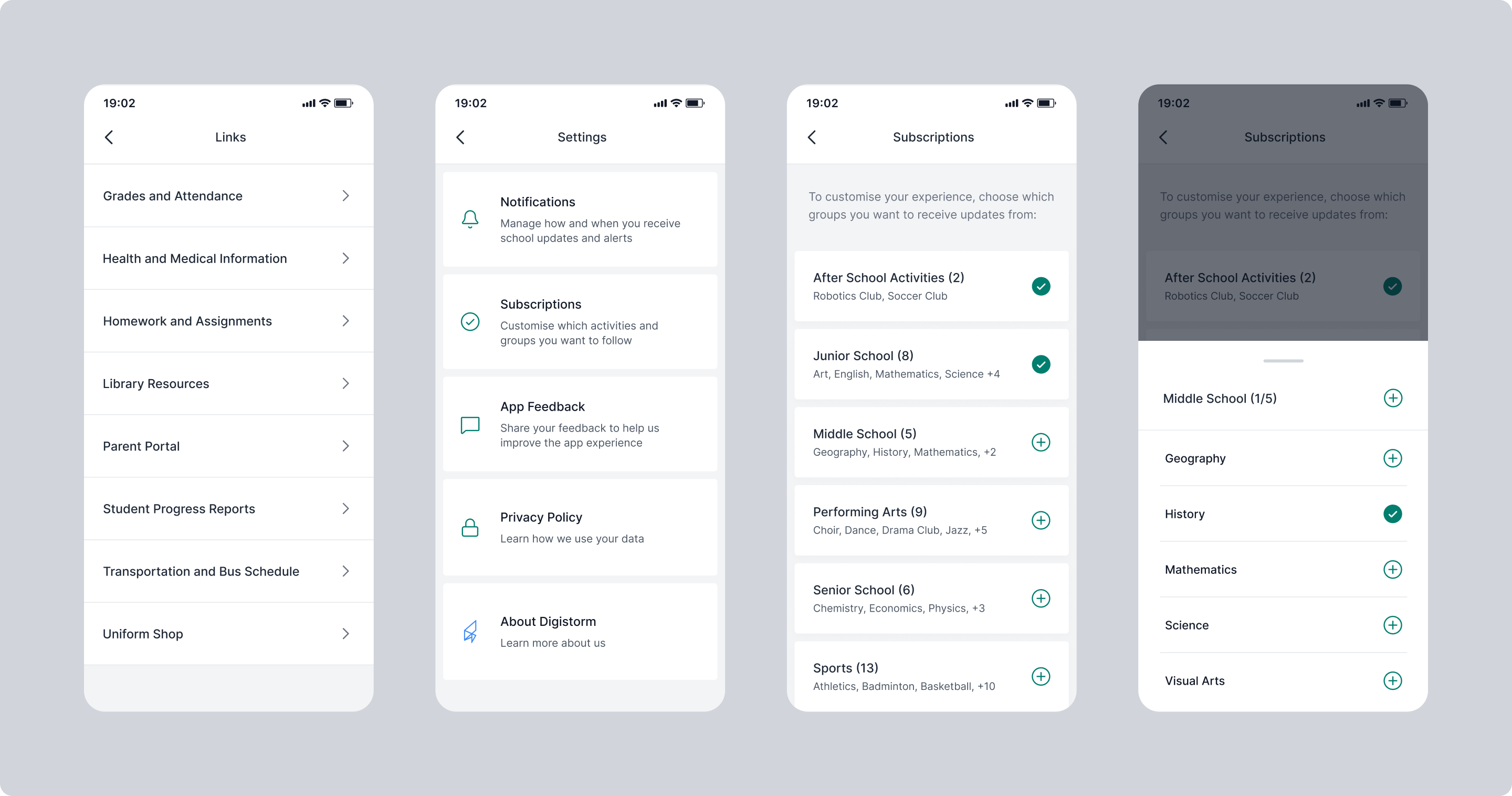
The first shared component framework for the app
Building a component library was the structural change that made everything else possible. Consistent components meant consistent modules, and a reliable foundation for integrating third-party school management systems.
Accessibility as a baseline requirement
Increased colour contrast and simplified interaction patterns were built into the component system from the start. The app needed to work for a wide range of parents and devices, and that shaped the design decisions throughout.
Impact
A consistent experience across every module
Standardised navigation and module structure gave parents the same intuitive experience across the platform, regardless of which part of the app they were using.
Branding that worked with the interface
School colours were applied consistently across the app without compromising the usability or visual coherence of the platform, regardless of the school's palette.
A foundation for integrations and future growth
The shared component framework supported third-party school management system integrations and established a scalable base for additional modules to be designed and built from going forward.