Merging two systems into one school enrolment journey
Digistorm Funnel is a school CRM system designed to streamline the enrolment process and nurture the relationship between schools and prospective families.
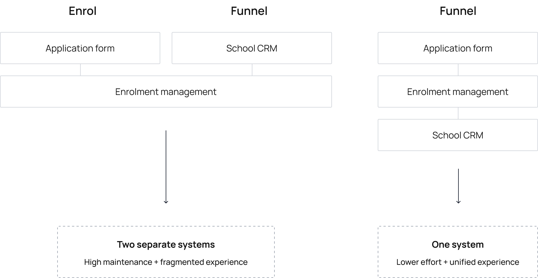
As Funnel gained popularity among schools, Digistorm decided to merge it with its existing product, Enrol — combining Funnel's back-end pipeline management with Enrol's customer-facing application process into a single, end-to-end enrolment system.
As the Product Designer, I collaborated closely with the Development team to design the new enrolment form and improve the system from both user and business perspectives.
Problem
The existing enrolment process created friction at multiple points. Returning applicants had no clear path to resume incomplete applications, leading to confusion and drop-off at a critical stage of the journey. The process relied on an open form that allowed anyone to start an application, increasing spam and creating additional workload for enrolment teams. From a business perspective, maintaining two separate systems added complexity to updates and feature development, making it difficult to deliver a consistent experience across the enrolment journey.
How might we unify the enrolment experience to reduce friction for families, streamline school operations, simplify maintenance, and enable customisation without compromising the experience?
Challenges
The project had to balance the needs of multiple user groups without disrupting the core experience:
- Families: first-time and returning applicants needed a clear, low-friction application journey
- Schools: enrolment teams needed higher-quality leads, reduced spam and a branded experience
- Business: needed a unified system that reduced maintenance overhead while preserving existing functionality
Process
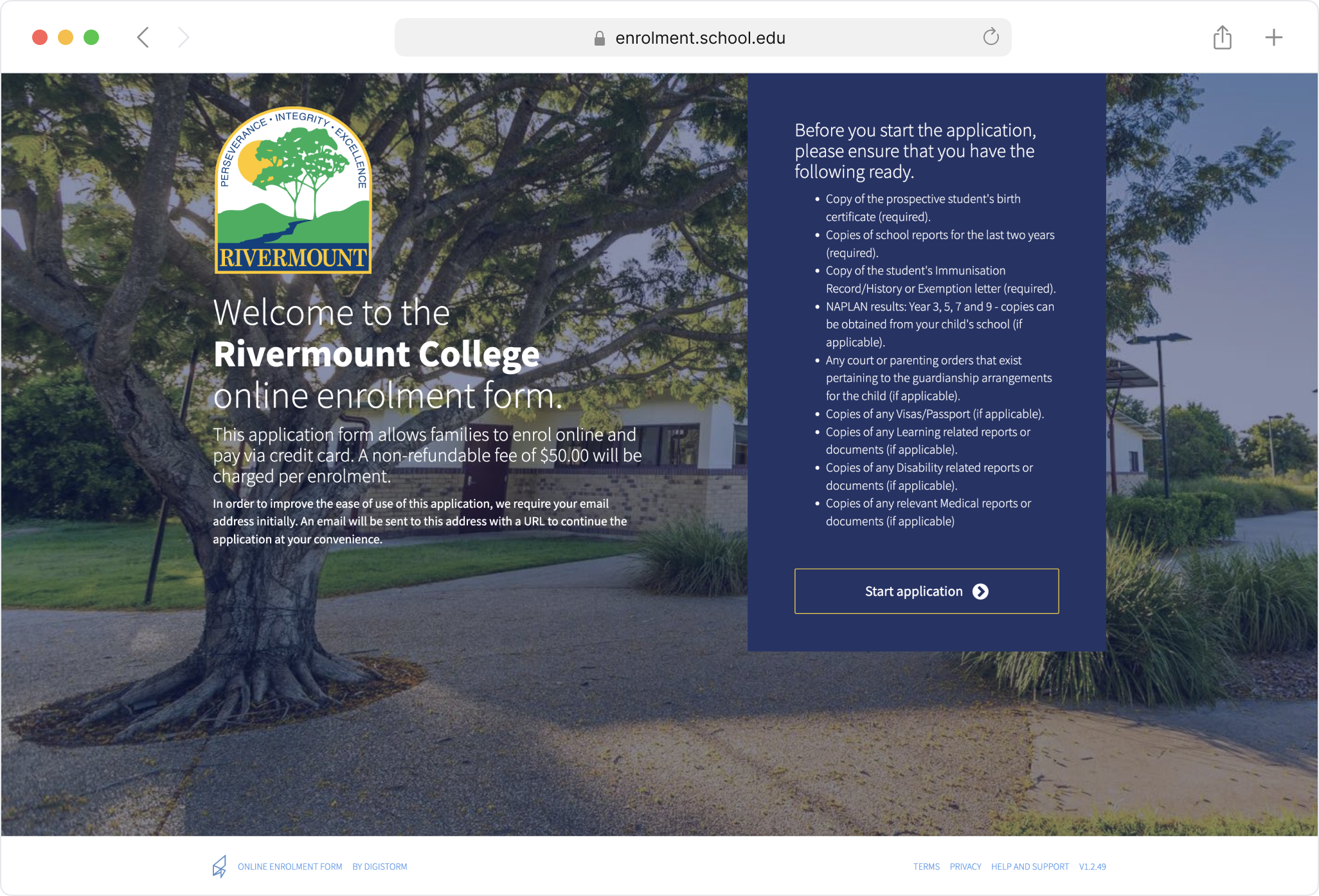
I started by analysing the current experience, reviewing user flows, form structure, and content to identify existing issues. I also collected feedback from schools to identify their pain points and gain a clear understanding of how to align their needs with key business objectives.From there, I developed initial wireframes outlining the core pages and user flow, focusing on clarity for parents by surfacing key information upfront. After iterating on the wireframes, I converted them into high-fidelity prototypes and tested them with a small group of existing clients using their own school branding, allowing us to validate assumptions and gather feedback before a wider release.
Key insights
The analysis and school feedback surfaced several issues that went beyond the known problems.
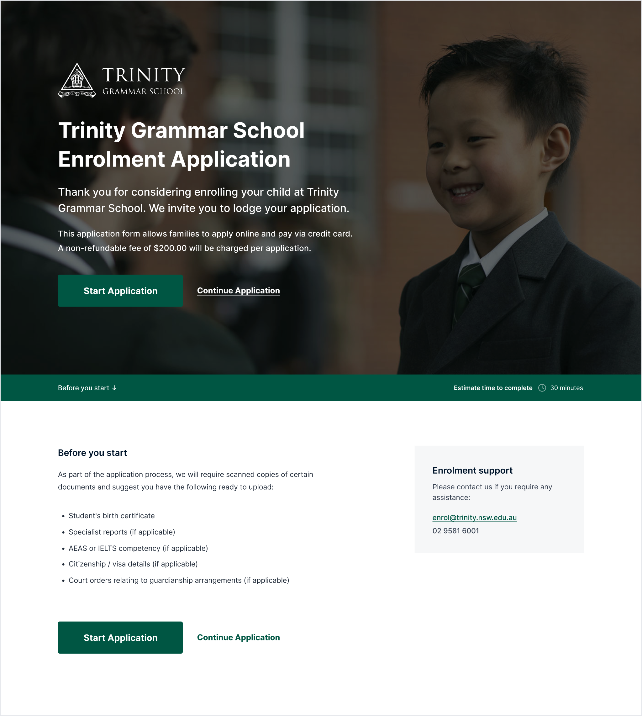
- The landing page presented required documents as a vertical list, pushing the primary call to action down the page as the list grew
- Schools expected a branded, customisable experience to differentiate themselves from competitors
- Accessibility and usability issues created additional friction throughout the application


Solution
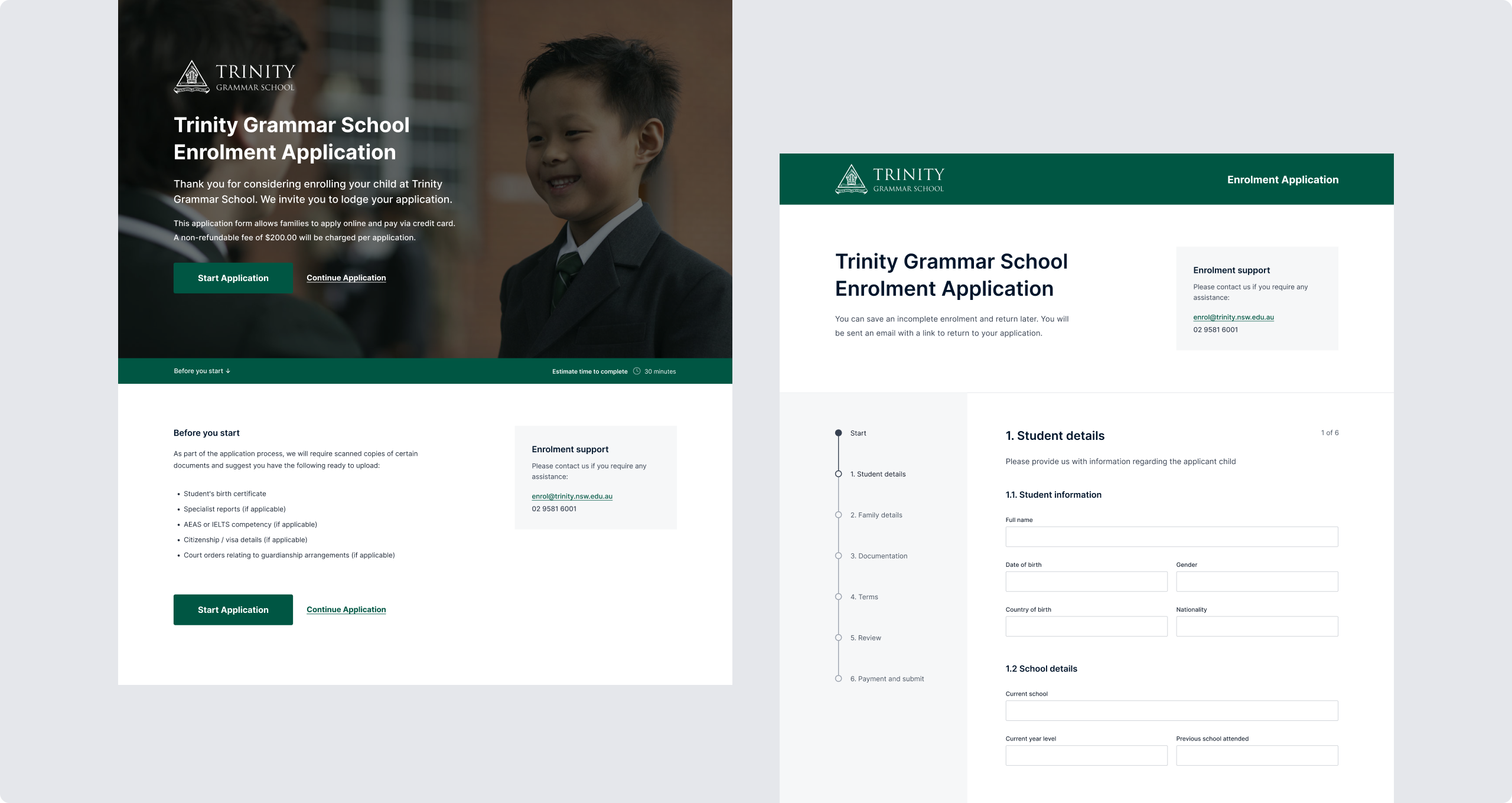
The redesign merged Funnel and Enrol into a single platform, combining back-end pipeline management with a redesigned customer-facing application experience.
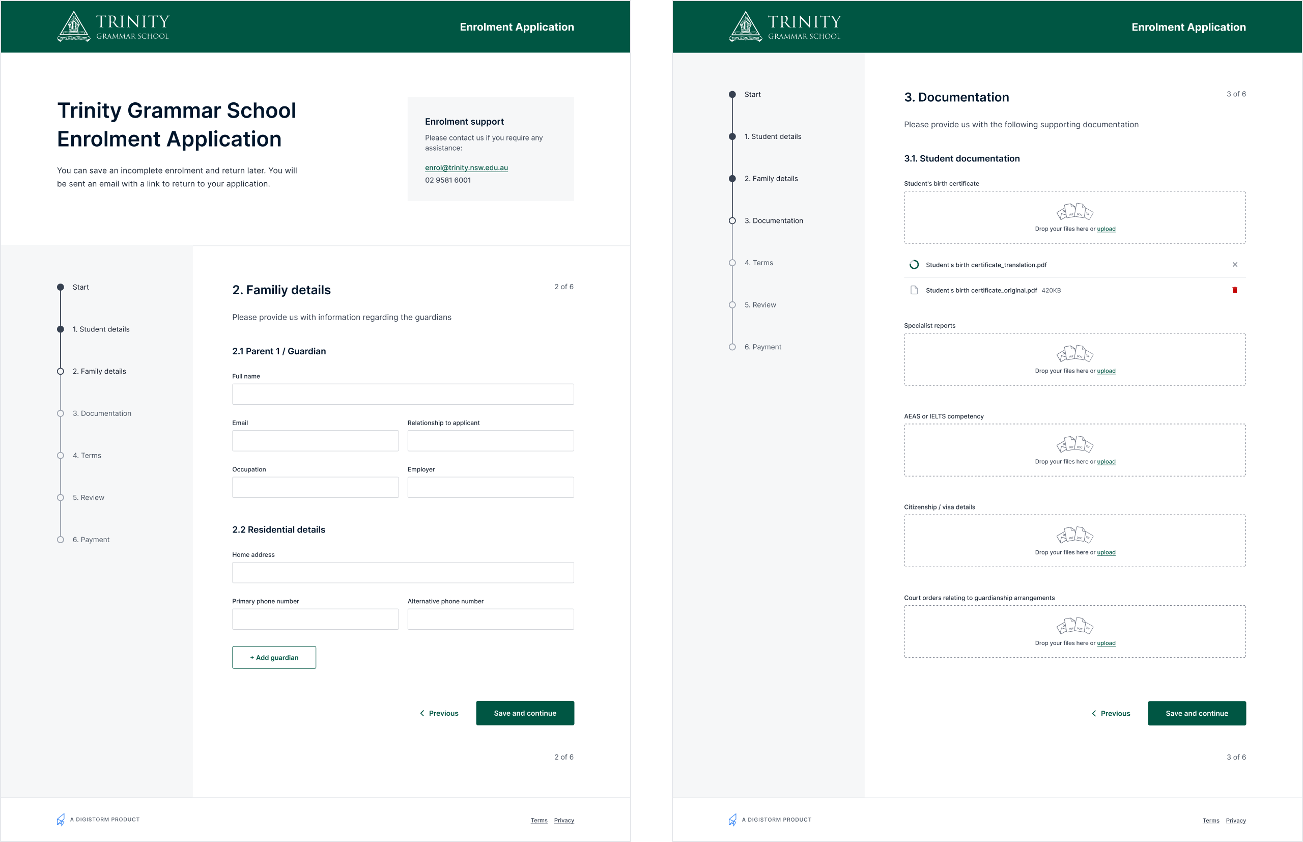
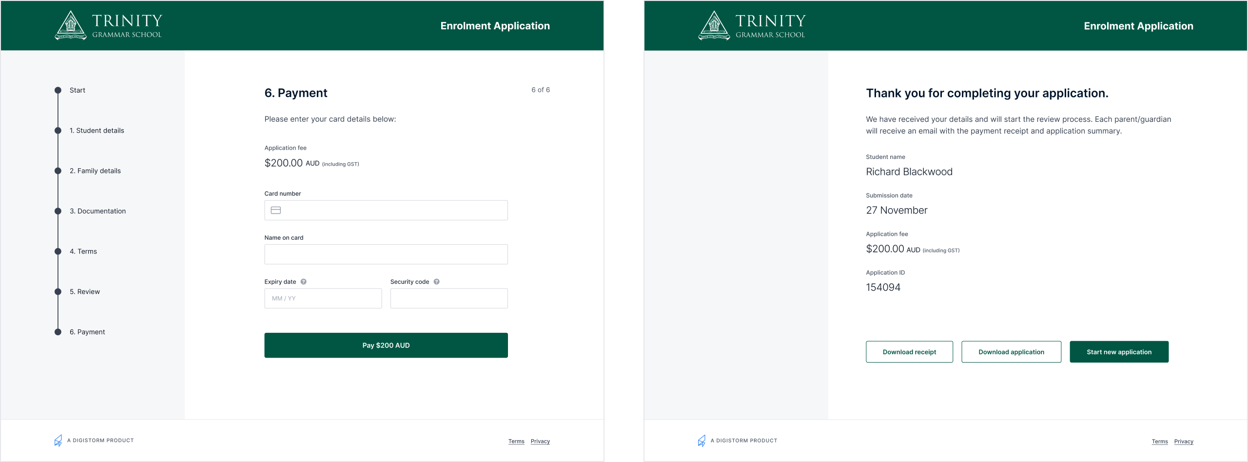
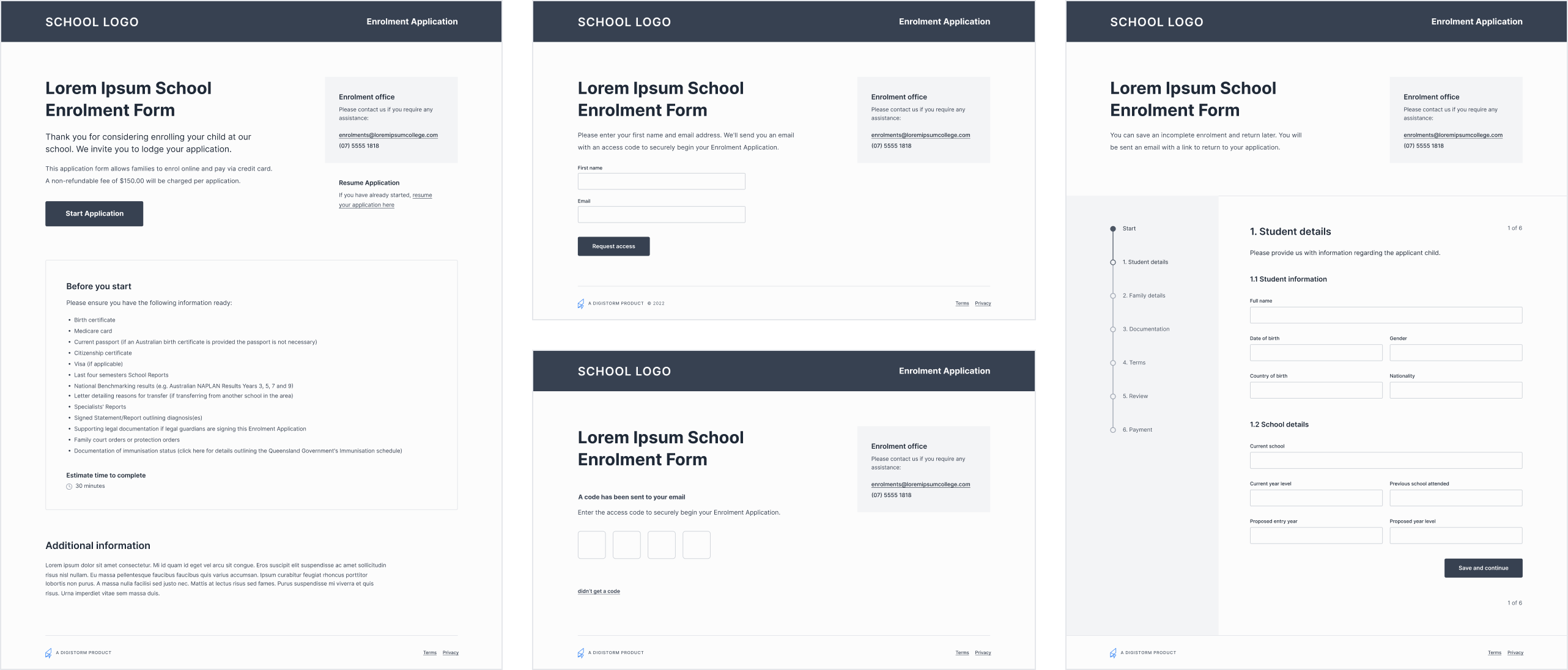
The application journey was restructured around clarity and confidence. Parents now receive upfront guidance on required documents and estimated completion time, supported by progress indicators and consistent help throughout the journey. A dedicated flow for returning applicants removes the confusion of resuming incomplete applications. Form fields, typography, and colour contrast were refined to improve readability and meet accessibility standards.
Schools gained customisable landing pages with the ability to upload branded imagery and custom backgrounds, allowing them to differentiate their forms and present a professional experience to prospective families. Enhanced verification flows for new and returning applicants reduced spam without adding friction for legitimate applicants.
The result combined the strengths of both products into one unified system, simplifying the process for families while giving schools better control, visibility, and confidence in the leads they received.
Impact
- Clearer guidance and a dedicated return flow reduced confusion and drop-off during applications.
- Enhanced verification reduced spam and improved lead quality for enrolment teams.
- Customisable pages enabled schools to deliver a branded, professional experience.
- Merging two systems reduced maintenance overhead and simplified feature delivery.
- A staged rollout with real schools validated the experience before wider release.
