Creating a more decision-focused automation experience
Context
Prebuilt journeys are designed to simplify the setup process, enabling users to quickly customise and launch automations with just a few clicks. The journey page is essential in this process: it's where users decide whether a template is right for them before proceeding, but the experience wasn't supporting that decision. Limited preview capabilities, fragmented information, and poor visibility of key features required users to create a journey in order to fully visualise it.
How might we redesign the journey selection experience to improve conversion from page view to active setup while creating a more scalable, consistent foundation for future journeys?
Research
Users couldn't properly evaluate a journey before committing
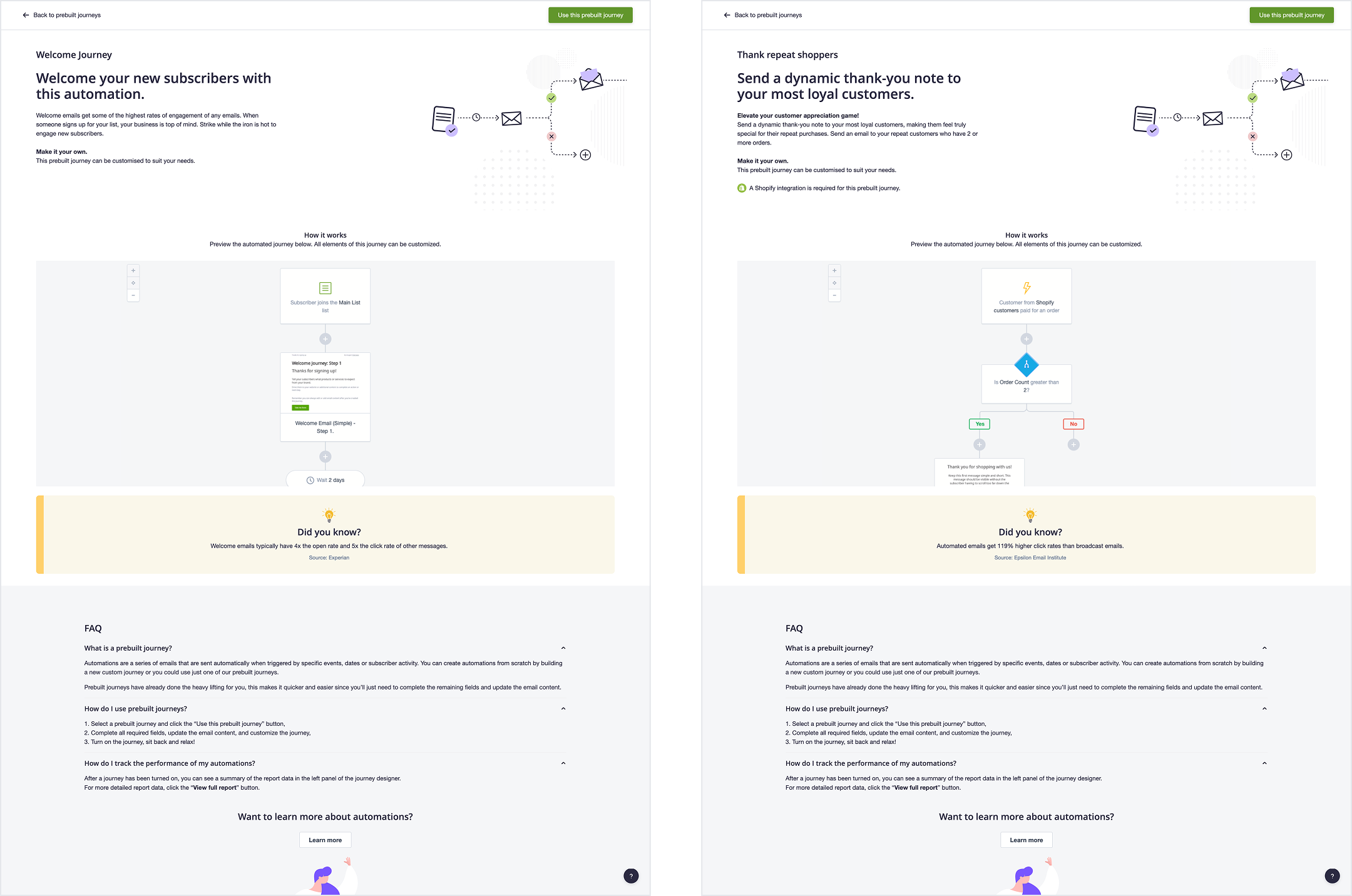
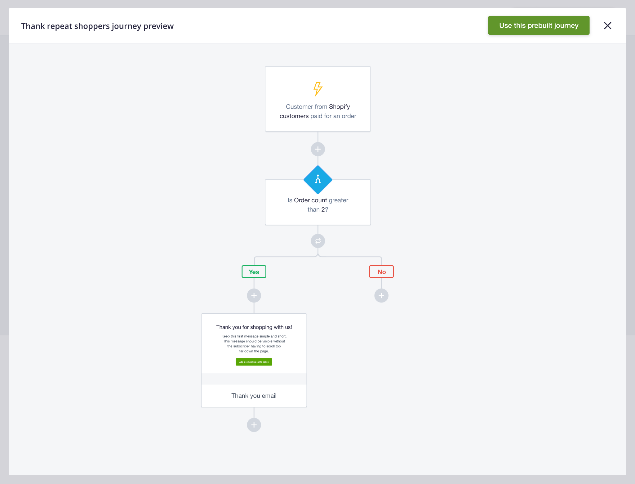
Users had very limited visibility into the workflow. The only preview was a static screenshot showing the first few steps of the journey. To visualise all steps, users had to create it first.
The experience encouraged commitment before confidence
Users were required to take action before they had enough information to determine whether a journey was right for them. This created a cycle where users would select a template, begin setup, realise it wasn't suitable, and abandon it in draft.
Four gaps were contributing to the uncertainty
The audit surfaced four specific points the experience was missing: visibility into the full workflow, clarity on whether a journey was the right fit, clear communication of its value, and a way to explore alternatives without leaving the page. These became the foundation for the redesign.

Key Interface Decisions
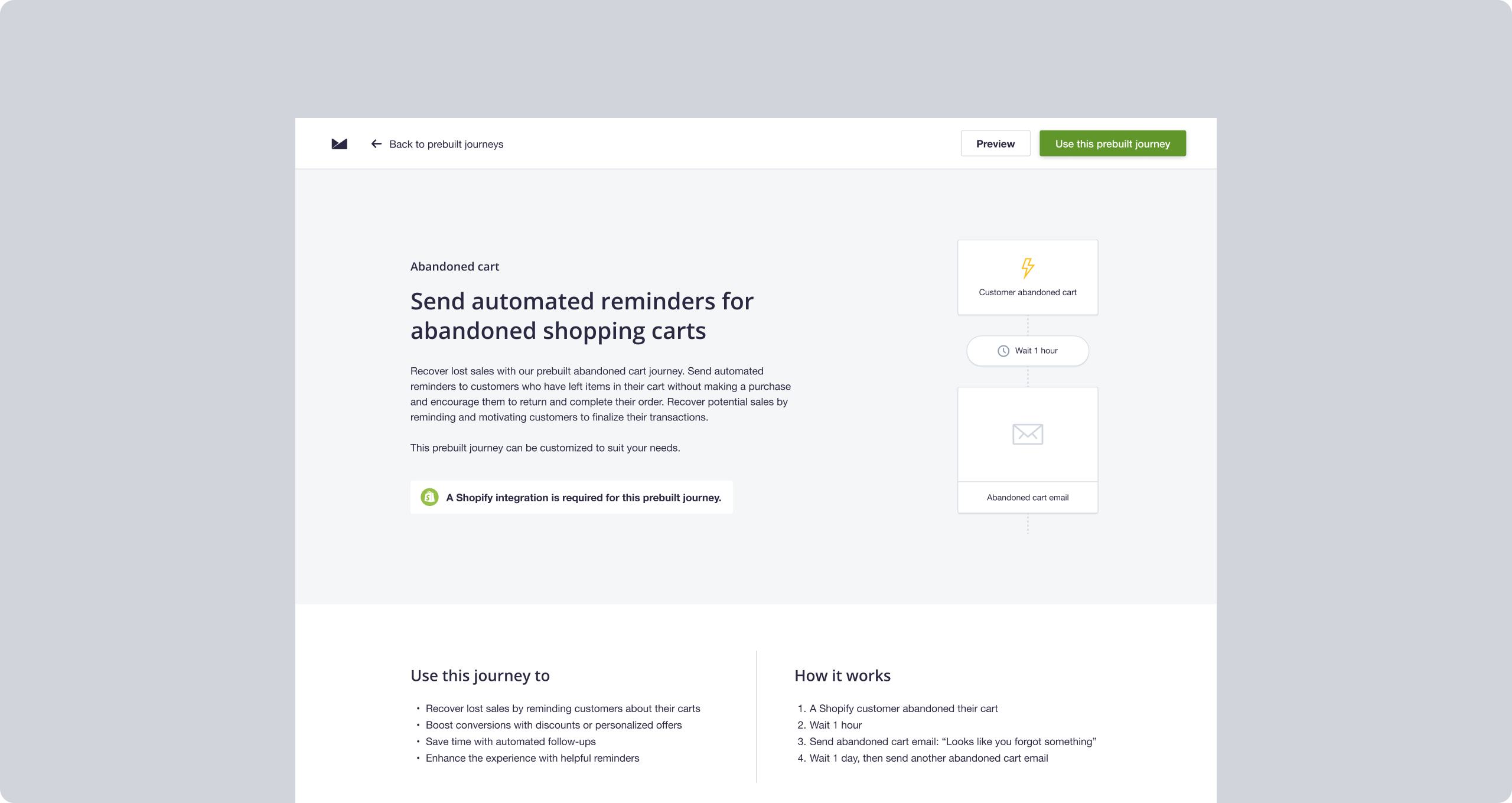
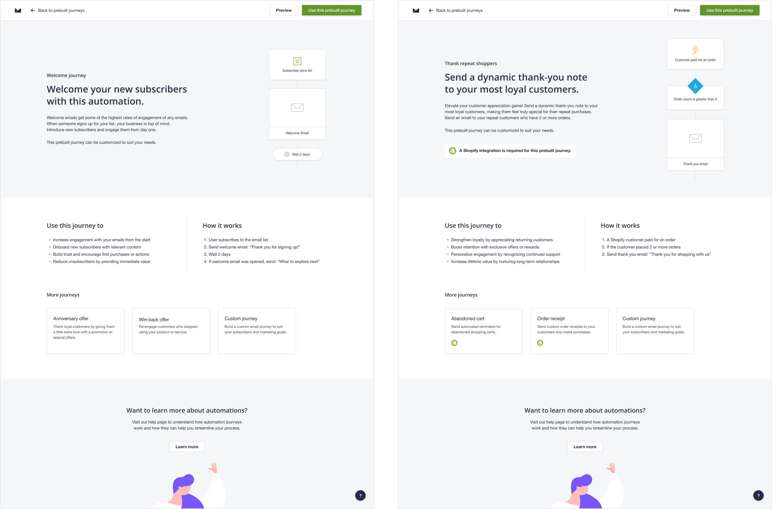
A journey preview as a core feature
The redesign introduced a full preview directly on the journey page. Users can now explore every step of the automation before creating it, removing the need to set up a journey just to evaluate it.
Simplified content hierarchy to lead with what matters
The information architecture was restructured to surface the most important information first. New sections were introduced to explain the journey's purpose, how it works, and what it's designed for, helping users quickly determine whether a template meets their needs.
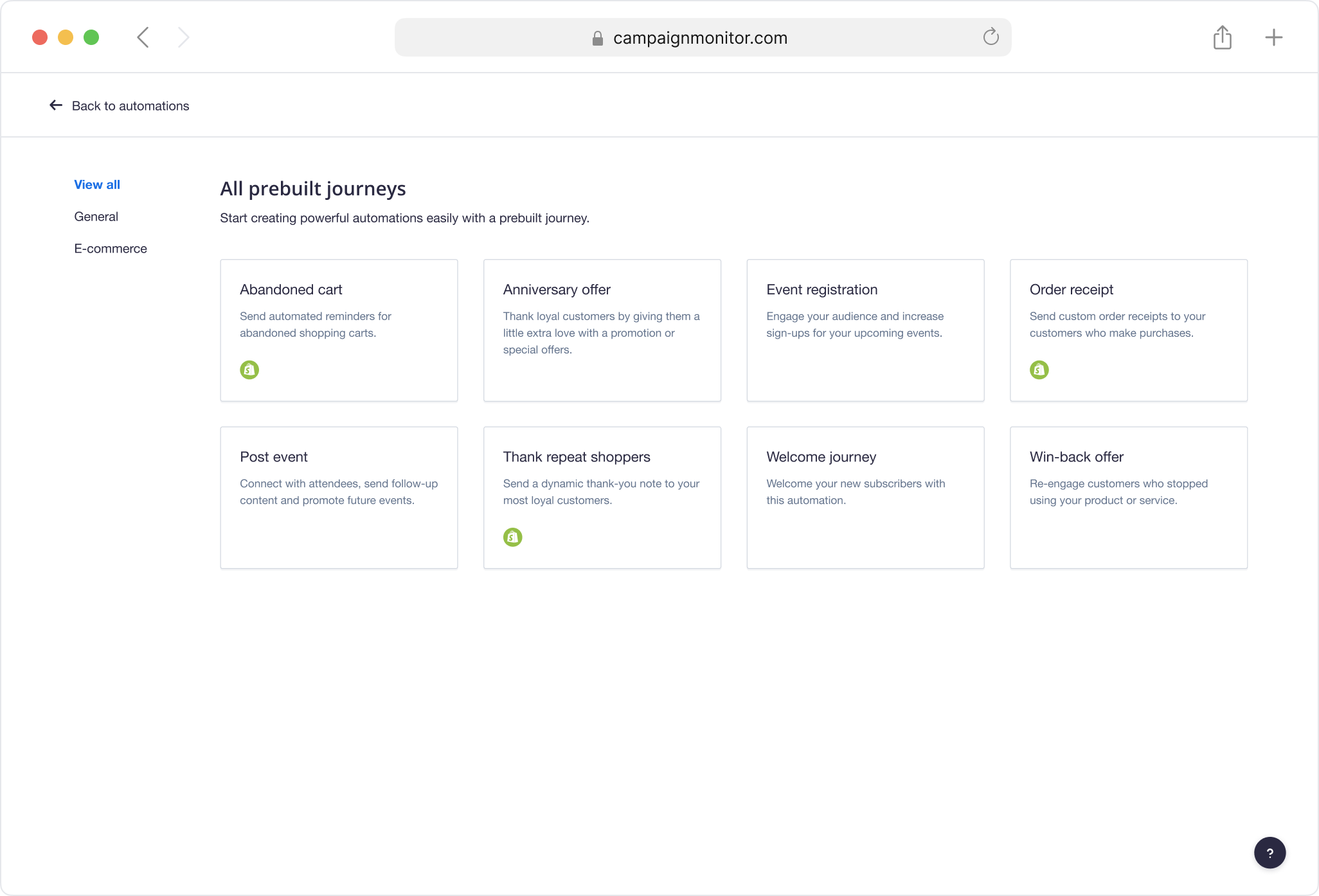
Related journeys as part of the experience
A related journeys section was added to support discovery. If a journey wasn't quite right, users could explore alternatives or choose to start from scratch without having to leave the page.
Built a scalable foundation
The prebuilt journey page template was rebuilt within the design system and made fully responsive, making future journeys easier to design and ship.
Impact
Removed a major source of abandonment
Users no longer need to create a journey to evaluate it. Surfacing the full automation upfront removed the friction that was contributing to journeys being left in draft.
Improved conversion from page view to setup
With more information available before committing, users were better equipped to move into active setup across all prebuilt journeys.
Established a scalable pattern for future templates
Standardising all pages within the design system reduced future design and development effort while creating a more consistent customer experience.